Y U K I S T U D I O S
Quench Advert
I was given a brief to create an advert for a juice company. The brief was very open and I was required to formulate how the juice would look and feel as well as creating the branding. The only requirements were to keep it vibrant, fresh and new and leave a small space for lopesum text. They also provided examples of adverts they preferred for inspiration.
Brainstorm

Typography


Compositions
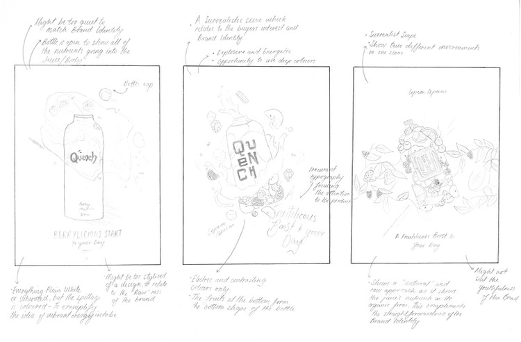
Developments
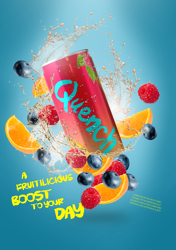
Portrait and landscape versions of the final advert. The feedback I received back was that
I needed to create an advert towards a more mature audience, which would require a
composition revaluation and rethinking.

Finals
These compositions fit the designated criteria more effectively and have created a more "active"
branding that promotes a healthier lifestyle. There is a careful consideration with the placement of text, which creates a more mature design for the advert and guides the viewer in a
more suitable fashion.

